

Uber
Advisory Forums Booking System
OVERVIEW
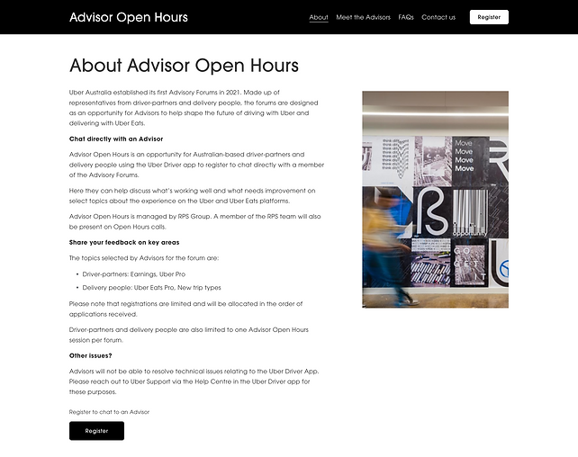
As the leading ride-hailing company, Uber needed an opportunity to gather feedback from their driver-partners and delivery people. Advisor Open Hours was designed
for Australia-based and New Zealand-based partners to chat directly with a member of the Advisory Forums about select topics and share their views. (Learn more about Uber Advisory Forums)
Uber engaged us to redevelop a booking platform where driver-partners and delivery people from both geographies could easily book a chat with an Advisor. I was responsible for the entire production cycle, ranging from ideation and design to development and testing. The final solution not only greatly enhanced user experience but also generated significant business value.
CLIENT
Uber Australia and New Zealand
RESPONSIBILITIES
-
Ideation
-
UI design
-
Development
-
User testing
-
Data reporting

CONTEXT
Uber Australia established its first Advisory Forums in 2021, comprising representatives from driver-partners and delivery people. In 2022, the Advisor Open Hours website, along with a booking system, was first introduced to support two Advisory Forums across Australia in May and September. In 2023, Uber expanded the Advisory Forums to New Zealand, holding its first session in July.
DESIGN CHALLENGE
The existing Advisor Open Hours website was originally developed in 2022 to serve Australia-specific content, with an integrated booking system allowing users to book
a chat with 28 Australia-based Advisors. However, as Uber was planning to expand the Advisory Forums to New Zealand in 2023, the website would need to accommodate New Zealand-based users as well, with an additional 28 New Zealand-based Advisors joining the Forum. This introduced a design challenge: how to ensure the website display region-specific content relevant to each user and directed them to the appropriate booking flow based on their location.
DESIGN PROBLEM
During the last two Advisory Forum sessions in 2022, a severe issue arose during the booking phase – a large number of users booked chats with mismatched Advisors through the system. For example, a driver booked a chat with an Advisor who is a delivery person, or vice versa. To correct these invalid bookings, the Advisor Open Hours project team had to contact affected users to cancel and rebook new chats, which not only cost the client a substantial budget and required extra resources and time from the project team, but also delayed the project's progress.
DESIGN TASKS
Based on the above, I defined the two primary design tasks:
-
Displaying the Australia-specific and New Zealand-specific website content based on the user's geographic location
-
Minimising the error rate of users booking a chat with a mismatched Advisor
HYPOTHESIS
As user research was not included in the project scope, and due to time and budget constraints, I proposed the design solutions based on the hypothesis:
Uber drivers and delivery people (user group) primarily use their mobile phones to browse the Advisor Open Hours website and need a fast, easy way to book a chat with an Advisor through the booking system.

DESIGN SOLUTION
I. Context
At the early stage of the project, it was unclear how Uber team would share the website with the integrated booking system to their driver-partners and delivery people. As a result, I considered two possible scenarios separately:
-
The Advisor Open Hours website and its booking system function as a stand-alone site with its own URL.
-
Uber provides access to the booking system within the Uber Driver app and Uber Eats app for both countries.
II. Design solutions overview
Based on these two possible scenarios, I proposed two design solutions:
-
All-in-one platform: Redesigning the website with the integrated booking system as an all-in-one platform that serves all users, including driver-partners and delivery people in both regions.
-
Four tailored websites: Creating separate region-specific websites, with each tailored to either Australia or New Zealand, leading each user group (driver-partners and delivery people in each region) to the appropriate booking flow.
Solution 1: All-in-one platform
In response to the design tasks outlined above, I came up with the below design strategies to address each task:
Design task
Displaying the Australia-specific and New Zealand-specific website content based on the user's geographic location
Minimising the error rate of users booking a chat with a mismatched Advisor
Design strategies
Branching users to separate webpage paths based on the region they select upon landing on the website
Extract the step of selecting the partner type from the booking flow and make it a standalone first step
Flowchart
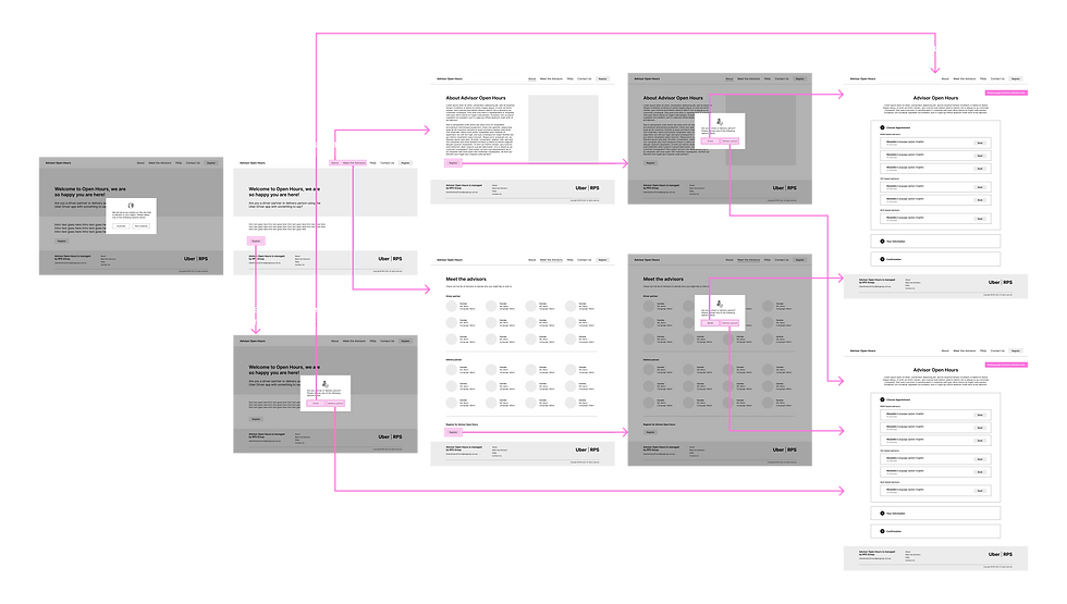
To map out the steps users need to take from entering the appropriate webpage path based on their region, to making a booking with a matched Advisor, I drew a flowchart to better communicate the defined user flow.
Wireflow
Next I created the wireflow to represent how the proposed solution could address the aforementioned challenge and problem by showing the flow of user interactions between screens.
Analysis
As a stand-alone platform with its own URL, Solution 1 offered the flexibility to be published independently or embedded within Uber apps. Additionally, with all paths integrated into one single site, it also simplified management and maintenance.
However, while Solution 1 is designed to address the design problem, it still cannot guarantee zero errors since users are allowed to select their region and partner type. Instead, it can only aim to minimise the error rate by streamlining and simplifying the user flow.
Solution 2: Four tailored websites
Solution 2 is not discussed in detail here, as the client ultimately approved Solution 1 as the final solution for the project.

CONTEXT
REFINING UI
Before implementing the design solutions, I also refined the web UI by aligning it with the Uber brand, as the existing site was not on-brand, and redesigning certain page layouts to enhance user-friendliness for Uber driver-partners and delivery people.
I. Aligning with Uber Brand
Core Colours
Black
#000000
White
#FFFFFF
Uber Eats green
#06C167
Fonts
UberMove - Light
UberMove - Regular
UberMove - Medium
UberMove - Bold
After embedding the custom font - UberMove on Squarespace, testing revealed that it reverted to Squarespace’s default font if UberMove was not installed on the viewer’s computer. To resolve this, I opted for ITC Avant Garde Gothic Pro, a built-in platform font that closely resembles UberMove.
II. Redesigning layout
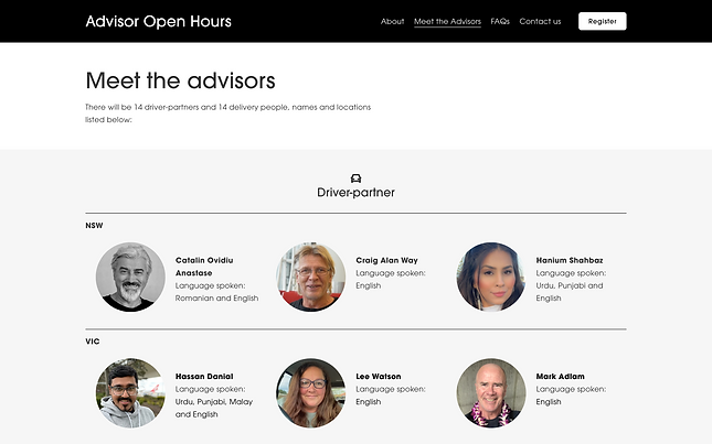
Meet the Advisor page:
Users should only select an Advisor based in their region. However, in the previous version of the webpage, under the two categories – Driver Partners and Delivery People, region information was displayed next to each Advisor’s profile thumbnail individually, making it hard for users to find local Advisors quickly.
To improve usability, I grouped the Advisors by region, restructuring the hierarchy to ‘Partner Type → Region → Advisor,’ so users can identify their region first before reviewing individual Advisor profiles:
Before:
.png)
After:
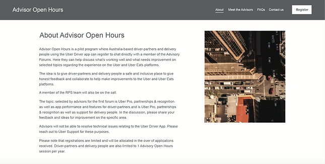
About page:
In the previous version of the About page, a large block of text was presented as a single section, making it overwhelming for users and difficult to grasp key points –especially on mobile screens. To improve readability, I worked with communications team to simplify and structure the content with subheadings:
Before:
.png)
After:
ONE WEBSITE WORKING AS TWO INTERCHANGEABLE WEBSITES
As part of the proposed design solution, the website needed to serve content relevant to the user’s region. To achieve this, I implemented the following steps:
-
Created region-specific webpage paths for Australia and New Zealand and integrated both within a single website.
-
Built separate navigation menus for each region and linked them to their respective webpage paths to ensure users stayed within the correct path
while browsing. Since switching between two navigation bars isn't a default Squarespace function, so I added custom code to enable this functionality.
Desktop version
<div data-wm=“new-nav” data-nav-id=“nav-au”>
</div>
<style>
/*Fade in New Header*/
#header.header-display-desktop,#header .header-display-mobile{
opacity:0;
visibility:hidden;
transform:translateY{-10px};
}
</style>
Mobile version

<style>
/*Hide All Footer Sections*/
footer .page-section{
display:none;
}
/*Show Footer Section*/
section[data-section-id=“649490bd47f6834a58928039”]{
display: flex !important;
}
</style>
-
Implemented region-specific footers with different contact emails (@rpsgroup.com.au and @rpsgroup.com.nz). As Squarespace doesn’t support multiple footers by default, I did custom coding to override this limitation.
Desktop version

Mobile version

-
Developed a custom region selection prompt that directs users to the appropriate webpage path upon landing. Since Squarespace lacks built-in lightbox functionality for this purpose, I used custom code to create the selection window.

<a class=“js-promo-lightbox” data-href=“/select-region” data-show-on-timer=“0.00001” hidden></a>
REDEFINING THE BOOKING FLOW
The previous version of the booking system was designed as follows:
-
All booking options (28 Advisors) were listed in a single column, divided into two groups – Driver Partners and Delivery People – each with a subtle heading.
-
Each option was presented only as the Advisor’s name, without profile information or image.
-
The instruction directed users to visit the "Meet the Advisors" page first and then return to the booking page to make a selection.
-
On mobile screen, this instruction appeared as a lengthy block of text above the booking list.
As a result, a large number of users selected an unmatched Advisor, and simply chose one of the first few options on the list.
Due to the lack of budget and time for user research, I instead analyzed the issue and inferred that Uber drivers and delivery people preferred a fast and effortless booking process, as they needed to stay alert for incoming orders. When browsing the Advisor list on their phones, they likely felt overwhelmed by the 28 options listed together, leading them to select one of the first few without scrolling further. Additionally, the partner type headings (in light gray) were too subtle to notice, and with each Advisor displayed only by name, users were more likely to make random selections.
Based on these insights, I proposed the following solutions:
-
Extract the partner type selection from the booking flow and make it the first step, followed by region selection and Advisor selection, with the final step being time slot selection.
-
In the Advisor selection step, display profile information and an image alongside each Advisor option.
-
Simplify and shorten the instructional text while also providing users with the links to reselect the partner type or region.
Partner type selection
Region selection
Advisor selection
Time selection
Information form


To ensure the booking flow functioned as designed, I was also responsible for setting up Acuity Scheduling and managing the Advisory Forum information on the platform, including:
-
56 Advisor profile pages (28 per region)
-
4 booking calendars, each containing a region- and partner type-specific booking form (AU-Driver, AU-Delivery, NZ-Driver, NZ-Delivery)
-
Available time slots for each of the 56 Advisors
-
Global scheduling limits
-
Intake form questions
-
Templates of confirmation email, reminder email, SMS reminder, rescheduling email, and cancellation email
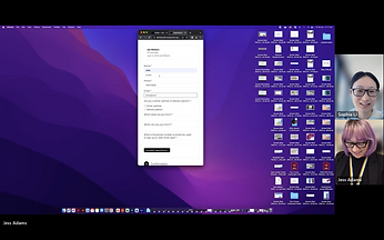
After the first round of development was completed, I took the initiative to conduct moderated user testing with 5 users. Throughout the process, I identified multiple usability issues and gathered insights that informed the next iteration.
I later documented the user testing process with results in a report and shared it with project manager and the client. At the same time, I organised a meeting with the entire project team to discuss the key findings.


USER TESTING
I. Testing methods
-
Think-aloud testing
-
Post-interview
II. Participant demographics
Although it would be ideal to test the system with real Uber drivers and delivery people, in fact only RPS staff could participate due to confidentiality concerns. So, I recruited 5 participants who had never seen the system before to ensure they were first-time users.


III. Testing tasks
To simulate the real-world experience of Uber drivers and delivery people, participants were asked to complete each task on their mobile phones within a time limit. I designed the tasks to focus on the platform's main goals: allowing users to book a chat easily and quickly, and informing them about the Advisory Forum.
Abstract task
The user can gather enough information to clearly understand the Advisory Forum before registering
The user can easily and quickly book a chat with a matched Advisor
Concrete task
Suppose you land on the website and want to understand the event. Find any relevant info to get a clear idea of what it's about.
Suppose you decide to book a chat with an Advisor. Please make your booking based on your partner type and location.
Task ID
#1
#2
IV. Participant performances
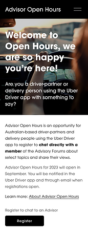
Task #1 – All 5 participants failed the task: they remained unclear about the event after reading the homepage copy and did not click the "Learn More" link on the homepage or navigation menu to visit the "About" page for further details.
Task #2 – All 5 participants successfully completed the task: they properly booked a chat with a matched Advisor effortlessly and quickly, with an average completion time of 30 seconds.
V. Key findings
Task #1 – Users can understand the Advisory Forum before registering
-
Users couldn’t understand what the event was about after reading the homepage copy.
- What does Advisor Open Hours mean?
- Is Open Hours something like a 24/7 hotline?
- Is this a complaint forum?
- What do people come here for?
- Why do people need to book?
-
They assumed all necessary information was on the homepage and didn’t explore further – no one clicked the hamburger menu to visit other pages.
-
All users clicked the "Register" button below, seemingly hoping to learn more, as the copy didn’t provide enough details (e.g., who the advisors are, what the select topics are).
-
The "Register" button appeared to be the next step, but users weren’t sure what they were registering for.
-
The homepage intro copy didn’t make it clear that the forum was with a singular person, so users were surprised when asked to select one.
Task #2 – Users can quickly and easily book a chat with a matched Advisor
-
Users made no errors while booking an appointment.
-
Feedback on the booking process: easy, straightforward, standard, and easier than Eventbrite.
Additional findings
Selecting an Advisor

Web copy appears much longer on a mobile screen
-
On the Advisor selection page, Advisors' profile images and spoken languages help differentiate them, so users can have a preference for whom they want to chat with.
-
In last year’s session, users likely didn’t visit the "Meet the Advisors" page. As a result, when selecting an advisor, they had little to distinguish between them and often chose randomly – typically the first few names on the list.
-
One user found the homepage copy overwhelming and difficult to grasp the key points.
-
One user mentioned that the subheadings on the About page was very helpful in highlighting the key points.
'More information will be shared via the Uber Driver app.’ on homepage
-
This sentence on the homepage seemed to suggest users should return to the Uber app, which might confuse them and lead them to leave the website.
ITERATION
Informed by the key findings, I developed the following solutions to address the usability problems and ultimately improve the overall user experience:
Proposed solutions
-
Keep the Register button as the primary CTA on the homepage, and add a "Learn more: About Advisor Open Hours" link above it.
-
Add a note above the Register button to clarify what the registration is for.
-
Revise the homepage copy to be more concise and informative, with key points highlighted.
-
Simplify the About page copy, as the current version feels overwhelming on mobile screens.
-
Remove or adjust the sentence "More information will be shared via the Uber Driver app." on the homepage to avoid potential confusion.

LAUNCH
Following the client's approval, the Advisor Open Hours website along with its booking system was launched on 20 July 2023.
On the launch day, over 60 appointments were successfully booked without any errors.
PERFORMANCE

At the debrief stage of the project, I created a data report to visualise and analyse the performance of the updated Advisor Open Hours booking system in 2023, comparing it to the previous version built in 2022. The goal was also to evaluate whether the design solution effectively addressed the high error rate happened in 2022.
During the first Advisory Forum in 2023, a total of 268 chats were booked, with only one duplicate booking and one with a mismatched Advisor. However, the latter error occurred because a user booked on behalf of another user, meaning it was not caused by the system itself. In contrast, the error rates for the first and second sessions in 2022 were 32.7% and 12.4%, respectively. With the new system, the error rate dropped significantly to 0.4%.
In this Advisory Forum, since only two bookings required correction, no additional dedicated resources were needed for remedial work – contacting the affected users to cancel and rebook their chats with the appropriate Advisor. As a result, the client achieved significant cost savings, and the project team conserved lots of time and resources that were previously spent fixing booking errors, which allowed the project to progress more smoothly and efficiently.

REMARKS FROM THE PM
"Sophia has been a powerhouse on our redevelopment of the Uber Advisory website.
Her approach which included a highly thought-out user experience journey and graphical elements delivered a high-quality outcome to the client in a short turnaround time with minimal changes. Her continued support and willingness to assist throughout the website's launch and booking phase ensured a smooth process with any adjustments able to be quickly actioned."
––– Alicia Rados · Project Manager